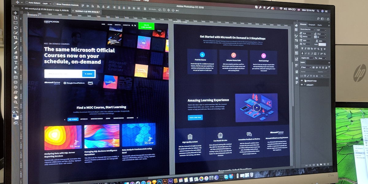
1. The Design-to-Code Revolution
**Pain Points of Traditional Workflow**:
1. **Design Misinterpretation**: Developers often misunderstand design intent
2. **Time-Consuming Manual Conversion**: Converting pixel-perfect designs to code takes significant time
3. **Responsive Adaptation Challenges**: Adapting for different screen sizes is tedious
4. **Design System Consistency**: Keeping code consistent with design systems is difficult
**2026 AI Solutions**:
- Automatically identify design components and layout patterns
- Generate semantic, maintainable code
- Intelligent responsive adaptation
- Deep integration with design systems
**Key Metrics**:
- Development time reduced by 75%
- Design fidelity improved to 98%
- Frontend bugs reduced by 60%
- Designer-developer collaboration efficiency increased 3x
2. Top Tools Comparison Review
**1. Locofy.ai**
```bash
# Install Figma plugin
# Search "Locofy" in Figma Community
# Export configuration
locofy export --framework react --styling tailwind --responsive true --components true
```
Features:
- Supports React, Vue, HTML
- Automatically generates responsive code
- Component-based output
- Deep integration with Tailwind CSS
**2. Anima**
```javascript
// Anima API integration example
import { AnimaSDK } from '@animaapp/code-sdk';
const anima = new AnimaSDK({
apiKey: process.env.ANIMA_API_KEY,
figmaFile: 'your-figma-file-key'
});
// Convert design to code
const code = await anima.convertToCode({
frameId: 'frame-123',
framework: 'react',
styling: 'styled-components',
optimize: {
responsive: true,
accessibility: true,
performance: true
}
});
console.log(code.jsx);
console.log(code.css);
```
Features:
- High-fidelity code generation
- Supports multiple CSS solutions
- Accessibility optimization
- Performance optimization
**3. Builder.io (Visual Copilot)**
```typescript
// Builder.io integration
import { builder, BuilderComponent } from '@builder.io/react';
builder.init('YOUR_API_KEY');
// Import from Figma
async function importFromFigma(figmaUrl: string) {
const content = await builder.get('page', {
url: figmaUrl,
import: true
}).promise();
return content;
}
// Render as React component
function MyComponent() {
return <BuilderComponent model="page" content={content} />;
}
```
Features:
- Visual editor
- Multi-framework support
- CMS integration
- A/B testing support
**Tool Comparison Table**:
| Tool | Code Quality | Responsive | Components | Pricing |
|------|--------------|------------|------------|---------|
| Locofy | 9/10 | Excellent | Excellent | $29/mo |
| Anima | 8.5/10 | Good | Good | $31/mo |
| Builder.io | 8/10 | Excellent | Good | $48/mo |

3. Practical Workflow
**Complete Design-to-Code Process**:
**Step 1: Prepare Figma Design**
```javascript
// Design checklist
const designChecklist = {
autoLayout: "Use Auto Layout instead of absolute positioning",
components: "Convert repeated elements to components",
naming: "Use clear layer naming",
styles: "Use design system variables (colors, fonts, spacing)",
responsive: "Create designs for multiple breakpoints"
};
// Automated check script
function validateFigmaDesign(figmaFile) {
const issues = [];
if (!figmaFile.usesAutoLayout) {
issues.push("Recommend using Auto Layout");
}
if (!figmaFile.hasComponents) {
issues.push("Recommend converting repeated elements to components");
}
return {
valid: issues.length === 0,
issues
};
}
```
**Step 2: Configure Export Options**
```json
{
"export_config": {
"framework": "react",
"styling": "tailwind",
"typescript": true,
"responsive": {
"breakpoints": {
"mobile": 375,
"tablet": 768,
"desktop": 1440
},
"strategy": "fluid"
},
"components": {
"extract": true,
"naming": "pascal-case",
"props": true
},
"optimization": {
"images": "webp",
"fonts": "preload",
"code_splitting": true
}
}
}
```
**Step 3: Generate and Integrate Code**
```bash
# Export using CLI tool
npx design-to-code export --figma-file abc123 --output ./src/components --config design.config.json
# Generated file structure
# src/components/
# ├── Header/
# │ ├── index.tsx
# │ ├── Header.test.tsx
# │ └── Header.stories.tsx
# ├── Hero/
# │ ├── index.tsx
# │ └── Hero.test.tsx
# └── Footer/
# ├── index.tsx
# └── Footer.test.tsx
```
**Step 4: Code Optimization**
```typescript
// Automated optimization script
import { optimizeCode } from 'design-to-code-utils';
async function optimizeGeneratedCode(componentPath: string) {
// 1. Extract repeated code as components
await optimizeCode.extractComponents(componentPath);
// 2. Optimize performance
await optimizeCode.addLazyLoading(componentPath);
await optimizeCode.optimizeImages(componentPath);
// 3. Add accessibility support
await optimizeCode.addA11y(componentPath, {
ariaLabels: true,
keyboardNavigation: true,
colorContrast: 'AA'
});
// 4. Generate tests
await optimizeCode.generateTests(componentPath);
}
```
4. Advanced Features: Design System Integration
**Automatic Design Token Mapping**:
```typescript
// design-tokens.ts
export const designTokens = {
colors: {
primary: {
50: '#eff6ff',
500: '#3b82f6',
900: '#1e3a8a'
},
secondary: {
50: '#f0fdf4',
500: '#22c55e',
900: '#14532d'
}
},
spacing: {
xs: '0.25rem',
sm: '0.5rem',
md: '1rem',
lg: '1.5rem',
xl: '2rem'
},
typography: {
heading1: {
fontSize: '2.25rem',
fontWeight: 700,
lineHeight: 1.2
},
body: {
fontSize: '1rem',
fontWeight: 400,
lineHeight: 1.5
}
}
};
// Auto-sync to Tailwind config
export function syncToTailwind(tokens: typeof designTokens) {
return {
theme: {
extend: {
colors: tokens.colors,
spacing: tokens.spacing,
fontSize: tokens.typography
}
}
};
}
```
**Component Library Auto-Generation**:
```typescript
// Generate component library from design system
import { DesignSystem } from 'design-to-code';
const ds = new DesignSystem({
figmaFile: 'design-system-file-key',
outputDir: './components'
});
// Generate Button component
await ds.generateComponent('Button', {
variants: ['primary', 'secondary', 'ghost'],
sizes: ['sm', 'md', 'lg'],
states: ['default', 'hover', 'active', 'disabled']
});
// Generated component code
/*
interface ButtonProps {
variant?: 'primary' | 'secondary' | 'ghost';
size?: 'sm' | 'md' | 'lg';
children: React.ReactNode;
onClick?: () => void;
}
export function Button({
variant = 'primary',
size = 'md',
children,
onClick
}: ButtonProps) {
const baseClasses = "rounded-lg font-medium transition-colors";
const variantClasses = {
primary: "bg-blue-500 text-white hover:bg-blue-600",
secondary: "bg-gray-200 text-gray-900 hover:bg-gray-300",
ghost: "bg-transparent text-blue-500 hover:bg-blue-50"
};
const sizeClasses = {
sm: "px-3 py-1.5 text-sm",
md: "px-4 py-2 text-base",
lg: "px-6 py-3 text-lg"
};
return (
<button
className={`${baseClasses} ${variantClasses[variant]} ${sizeClasses[size]}`}
onClick={onClick}
>
{children}
</button>
);
}
*/
```
5. Best Practices and Considerations
**1. Design Specification Preparation**
```markdown
## Design File Preparation Checklist
### Must Do
- [ ] Use Auto Layout
- [ ] Consistent naming conventions
- [ ] Use design system variables
- [ ] Create component variants
- [ ] Provide multi-breakpoint designs
### Recommended
- [ ] Add interaction notes
- [ ] Annotate animation parameters
- [ ] Provide icon assets
- [ ] Explain edge cases
```
**2. Code Quality Checks**
```javascript
// Automated code quality checks
const qualityChecks = {
semanticHTML: checkSemanticHTML(code),
accessibility: checkAccessibility(code),
performance: checkPerformance(code),
maintainability: checkMaintainability(code),
responsiveness: checkResponsiveness(code)
};
const score = calculateQualityScore(qualityChecks);
console.log(`Code quality score: ${score}/100`);
```
**3. Continuous Integration**
```yaml
# .github/workflows/design-sync.yml
name: Design to Code Sync
on:
push:
paths:
- 'designs/**'
jobs:
sync:
runs-on: ubuntu-latest
steps:
- uses: actions/checkout@v4
- name: Sync from Figma
run: |
npx design-to-code sync --figma-token ${{ secrets.FIGMA_TOKEN }} --output ./src/components
- name: Run tests
run: npm test
- name: Create PR
uses: peter-evans/create-pull-request@v5
with:
title: "Auto-sync: Design updates"
body: "Automated design-to-code sync"
```
**4. Performance Optimization**
```typescript
// Image optimization config
const imageOptimization = {
formats: ['webp', 'avif'],
sizes: {
mobile: { width: 400, quality: 75 },
tablet: { width: 800, quality: 80 },
desktop: { width: 1200, quality: 85 }
},
lazyLoad: true,
placeholder: 'blur'
};
// Code splitting
const codeSplitting = {
routes: true,
components: true,
vendors: true
};
```
Use our [JSON Formatter Tool](/tools/json-formatter) to configure your design system.
Conclusion
AI design-to-code tools have matured in 2026 to handle real production projects. Key takeaways:
1. **Design Quality Determines Code Quality**: Invest time in preparing well-structured designs
2. **Tool Selection Matters**: Choose the right tool based on project needs
3. **Manual Review Is Essential**: AI-generated code still needs human optimization
4. **Continuous Integration**: Establish automated design-code sync workflows
Try these tools now and take your design workflow to the next level. Explore our [Developer Tools Collection](/tools) to optimize your development process.
Frequently Asked Questions
How good is the quality of AI-generated code?
2026 tools can generate 8.5-9/10 quality code, but manual review and optimization are still needed, especially for complex interactions and performance optimization.
Which frameworks are supported?
Mainstream tools support React, Vue, Angular, Svelte, HTML/CSS, and some also support React Native and Flutter.
How do you handle complex interactions?
Current tools mainly handle static UI. Complex interactions (like drag-and-drop, animations) still need manual implementation or specialized libraries.
What's the cost-benefit?
Tool subscriptions cost $30-50/month, but can save 75% of frontend development time. ROI is typically achieved within 1-2 months.
How do you integrate with design systems?
Modern tools support automatic syncing of design tokens, components, and styles from Figma, keeping code consistent with design systems.